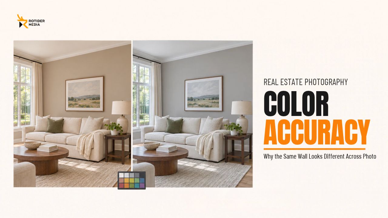
A living room looks warm beige in one listing photo and cool gray in the next. Both images are bright and sharp, but together they leave a basic question unanswered: what color is the room?
Color accuracy in real estate photography helps buyers understand a property’s finishes and gives agents a more consistent gallery to publish. Getting there takes a useful reference, controlled editing, and a final review that considers how the images work together.
What Does Color Accuracy in Real Estate Photography Mean?
Color accuracy means representing a property’s paint, flooring, cabinetry, and other finishes as faithfully as the photographic process allows. For a listing, the practical goal is to help viewers recognize those materials without introducing misleading color shifts.
Three related ideas guide the work:
|
Term |
What it means for listing photos |
|
Color accuracy |
The image provides a faithful representation of the property’s colors. |
|
Color consistency |
The same finishes remain visually coherent across different photographs. |
|
Color grading |
Creative adjustments establish a particular mood or visual style. |
As Adobe’s explanation of color grading describes, grading shapes the visual tone of an image. For property photography, that creative treatment needs to respect the finishes being represented.
A consistently warm preset, for example, might make an entire gallery feel cohesive while shifting gray cabinets toward beige. Consistency alone would not make that result accurate.
Rotider’s perspective: Judge the finished gallery by whether viewers can recognize the same materials from one angle to another. An attractive individual image still needs to make sense beside the next photograph.
Why Does the Same Wall Look Different Across Photos?
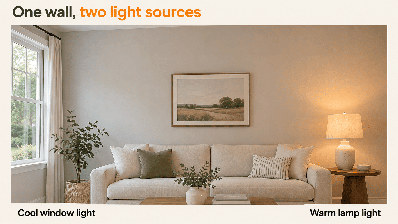
Before correcting a mismatch, identify whether it affects the entire frame, a specific area, or the way a surface’s brightness has been rendered. Those situations call for different editing decisions.
Mixed Lighting and Reflected Color
A single interior room often receives cool daylight through windows, warm light from lamps, and bounced reflections off surrounding surfaces all at once. Consequently, distinct zones within the same frame can display noticeably different color casts.
Shifting camera placement also changes the visual weight of each lighting zone in the composition. A wide angle might emphasize the window-lit side of the room, whereas another vantage point places a lamp-lit wall front and center.
This is why global color adjustments frequently leave parts of an image looking off, posing a core challenge for maintaining accurate color across mixed-light spaces. Adobe’s local adjustment controls include temperature and tint controls inside selective masks, enable editors to isolate and correct color casts within targeted areas.
The key editorial decision is determining how much color variation to preserve. A subtle warm glow around an active lamp helps viewers read the light source naturally, while a broad yellow cast that makes a white wall appear painted a different color requires careful correction.
White Balance and Editing Differences Between Frames
White balance directly governs the overall color reproduction of a photograph. Adobe identifies temperature and tint as the primary controls and recommends sampling a neutral light-gray area when using Lightroom’s White Balance Selector tool.
Color discrepancies can also emerge later in the post-processing workflow. One frame might have received a heavier preset, a different camera profile, or more aggressive tone adjustments than another shot in the same set.
Rather than assuming every color mismatch stems from a single root cause, work through the following diagnostic checklist:
|
What you notice |
What to check first |
|
Most surfaces look warmer or cooler in one image |
White balance, profile, and any global color treatment |
|
Only the corner near a fixture looks yellow or green |
Local lighting and the adjustments applied to that area |
|
Dark paint looks pale in one angle |
Exposure, shadow lifting, contrast, and saturation |
|
Cabinet color changes after applying a preset |
The preset’s color and tone adjustments |
|
The downloaded image differs from the editing preview |
Export settings, color profile, and viewing conditions |
How to Capture a Useful Color Reference Before Editing
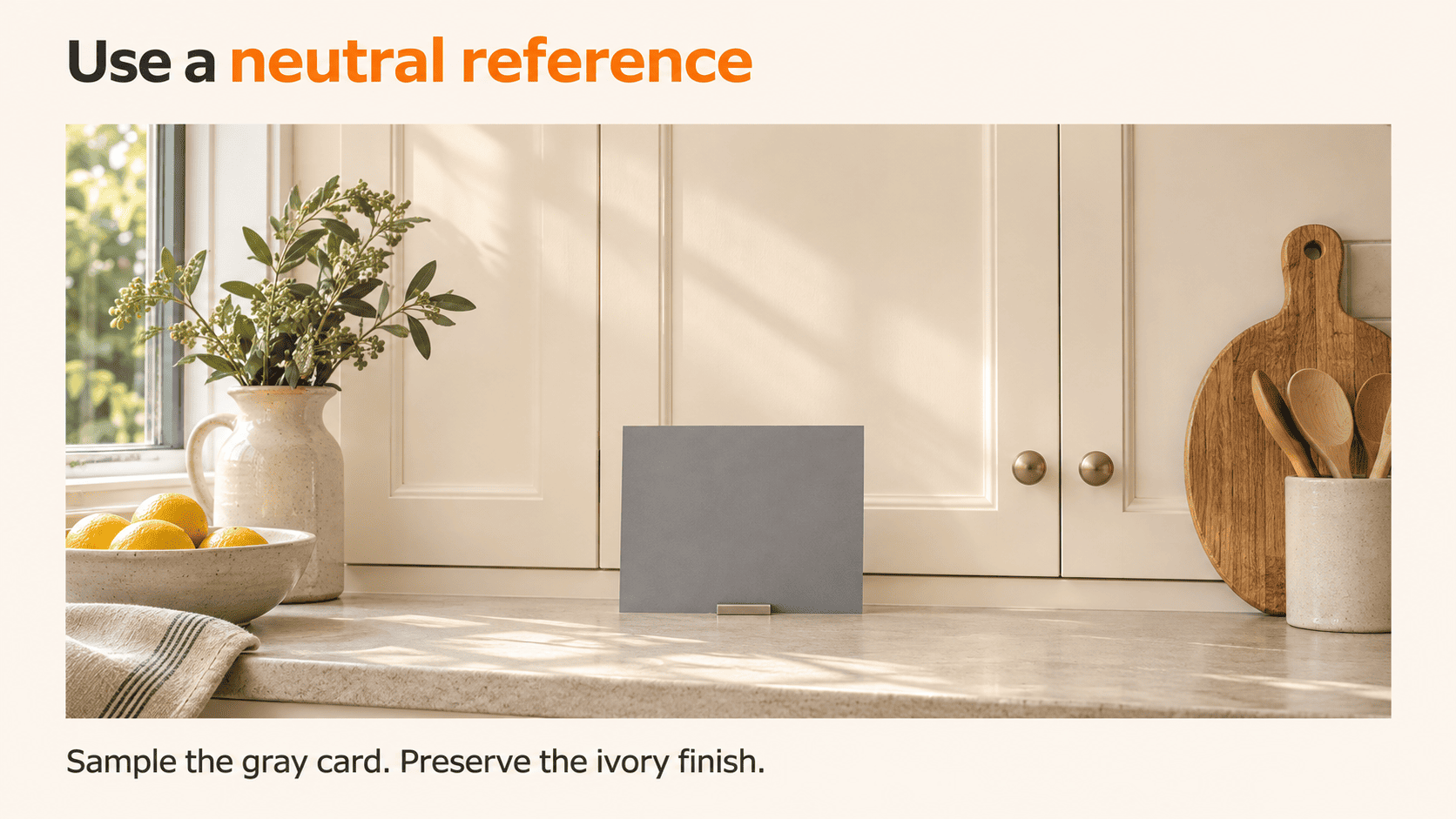
The editor needs more than a request to “make the colors natural.” A reference gives that instruction something concrete to work from.
Record a Reference for Each Lighting Setup
Capture a suitable neutral reference target under the exact lighting conditions present in that specific room. Store this reference frame alongside the corresponding image set, and shoot a fresh reference whenever ambient lighting shifts noticeably.
Calibrite’s guidance on using a ColorChecker recommends using the reference to establish a starting point and synchronizing relevant settings across photographs made under the same lighting conditions.. That condition is critical: a reference frame captured in a sunlit kitchen cannot be applied to accurately color-balance a bathroom lit by different artificial fixtures.
To streamline handoffs to post-production editors and keep color consistent across the entire project, include the following with every delivery:
-
Reference frames paired with clear room identifiers.
-
Notes specifying which light sources were turned on during the shoot.
-
Documentation of any significant lighting changes between camera angles.
-
Original RAW files along with all associated bracketed exposures.
For bracketed shooting workflows, Adobe recommends capturing in RAW format and locking a manual white balance setting to prevent color shifts between individual exposures. These practices establish a stable, predictable baseline for post-processing.
Give the Editor Context About Paint and Materials
Never assume ceilings, cabinetry, or walls are neutral white simply because they appear off-white in a preview frame.
Architectural finishes are frequently painted in intentional cream, ivory, or warm gray tones. Sampling these surfaces as a neutral white-balance point without verifying them will shift the color temperature of the entire room. Calibrite specifically notes that everyday white or gray objects inside a scene are not reliably color-neutral reference targets.
Clear handoff notes for post-production editors should specify details such as:
-
“Kitchen cabinets are finished in warm ivory. Preserve this undertone rather than shifting them to bright white.”
-
“The walls, ceiling, and trim in the living room are all coated in the same deep green paint.”
Paint names and manufacturer swatches provide helpful context, but they cannot replace on-site color references. Online product photos do not accurately reflect how a surface finish behaves under the exact lighting conditions of that specific room.
How to Correct Color Casts Without Losing the Room's Character
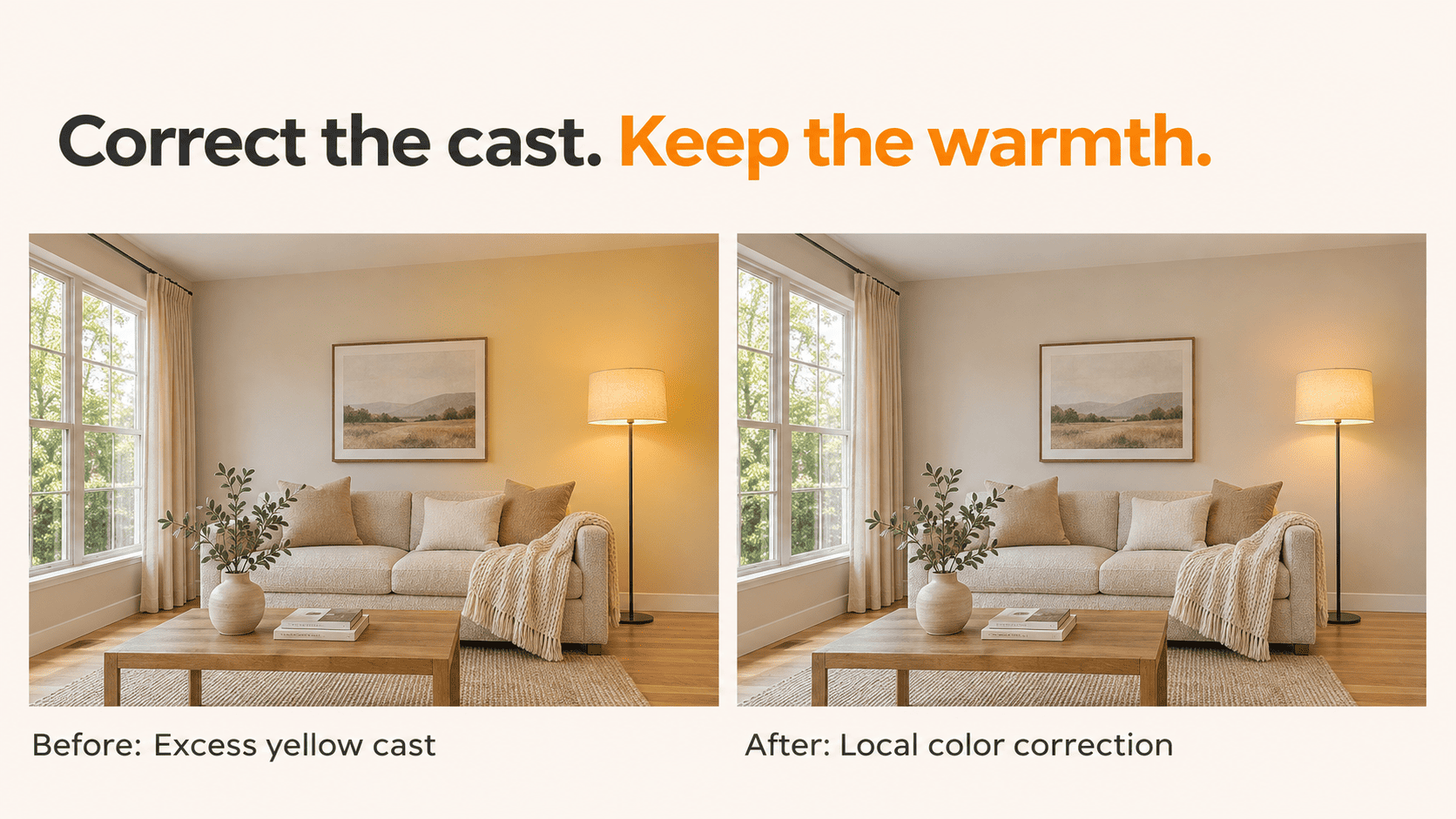
The following workflow is Rotider’s recommended approach to reviewing a room across several angles. It combines an overall starting point with targeted corrections and a final comparison.
Establish a Base White Balance, Then Address Local Casts
Start by establishing an accurate global color balance from your reference shot, then inspect the transition zones where different light sources overlap.
Consider a room featuring beige walls, a large daylight window, and a floor lamp casting warm light. Cooling down the entire frame to neutralize the lamp’s yellow cast will push the window-lit side into an unnatural blue. Selective local adjustments give editors precise control over affected areas without distorting adjacent surfaces.
In Lightroom, masking tools allow independent adjustments to temperature and tint within targeted zones. Adobe specifically highlights localized temperature adjustments as an effective solution for scenes lit by mixed color temperatures.
To maintain reliable color consistency in this scenario, follow this sequence:
-
Establish global white balance using the on-site reference image.
-
Isolate the specific wall section showing an unnatural color cast.
-
Apply a subtle, measured local color correction.
-
Inspect the transition edges around the mask boundary for seamless blending.
-
Cross-check the edited frame against another angle of the same room.
The final two steps are essential to the workflow. A corrected zone must blend naturally with the rest of the wall, and the final color rendering must remain consistent across the broader image set.
When communicating revision notes, avoid vague instructions such as “remove all warmth.” Instead, pinpoint the exact issue: for example, noting that a wall has an excessive yellow cast, cabinetry is picking up a green tint, or the same material surface shifts noticeably between different camera angles.
Read more: Luxury Real Estate Video Trends 2027: How to Edit for the Way a Home Feels
Review HDR and Color Grading Against the Reference
HDR merging combines bracketed exposures into an image with a wider captured tonal range, it is not a substitute for checking white balance and local color.
For HDR real estate post-processing, evaluate the merged composite thoroughly before signing off on final delivery using these checkpoints:
-
Do dark paint finishes retain their intended visual depth without looking washed out or muddy?
-
Are wood grains and stone surfaces clearly recognizable when compared directly against the on-site reference shot?
-
Have bright, light-colored surfaces lost essential material texture due to over-brightening?
-
Have local adjustments spilled beyond the edges of the target surface?
-
Are different angles of the same space processed too inconsistently from one another?
Pay close attention to rooms where the walls, ceiling, and trim are painted in a single uniform color. These continuous surfaces serve as a reliable benchmark for verifying whether post-processing preserved the original architectural design.
Whenever applying a creative color grade, toggle a before-and-after comparison. If the grade obscures or distorts how real materials read on screen, dial back its intensity or recalibrate the tones. At Rotider, the final deliverable must always represent the property's actual materials and true appearance.
How to Check Color Consistency Across the Finished Gallery
A room-by-room review should follow the individual edits. This is where mismatches that were easy to overlook in isolation become easier to identify.
Compare Shared Walls, Cabinets, and Flooring
Place two overlapping camera angles side-by-side for review. Select continuous surfaces that appear in both frames, such as the wall behind a sofa, a run of kitchen cabinetry, or a shared section of flooring.
Evaluate the frames using these three fundamental questions:
-
Identification: Does the surface preserve its original paint color or material finish?
-
Lighting: Is the visual difference between frames logical and natural under the space's actual lighting conditions?
-
Editing: Are there abrupt color shifts, uneven masking artifacts, or a loss of surface detail that require correction?
Pixel values do not need to match identically across different camera angles. The primary objective is to deliver a cohesive set of images where lighting variations feel natural and believable.
For instance, a wall might render brighter near a window while still preserving its recognizable paint color. Forcing the entire wall to an uniform exposure level flattens the image and strips away valuable spatial lighting cues.
A quality control reviewer can apply this method to provide clear, actionable feedback without getting bogged down in technical jargon:
-
"The kitchen cabinets appear warm ivory in shot 08 but shift to a cool gray in shot 11. Please cross-check these frames against the initial color reference target."
This feedback structure gives editors the exact location to inspect, the specific asset to reference, and the expected visual outcome needed to maintain reliable color accuracy across the deliverable set.
Check the Export and Viewing Conditions
Review the files that will actually be delivered, not only the editing preview.
For standard web delivery, sRGB is a practical default unless the client or destination specifies otherwise. Lightroom Classic also provides export controls that convert and tag images with the chosen color profile.
A calibrated and profiled monitor provides a more dependable basis for judging color. It does not make every viewer’s screen identical.
For Rotider’s proposed final check:
-
Open the exported files and compare them with the approved edits.
-
Review the gallery in its intended sequence.
-
Inspect representative images in the delivery gallery or destination preview.
-
Investigate device-specific differences before changing the whole batch.
If a client reports a mismatch, first confirm that both parties are looking at the same exported file. Then compare viewing conditions before deciding whether the edit needs revision.
Read more: Real Estate Photography Lighting for Natural, Balanced Property Photos
What to Include in a Color-Correction Brief for Your Editor
A useful brief names the materials that matter and provides evidence for the requested result. “Bright and natural” can describe the general style, but it leaves many color decisions unresolved.
Use this structure when sending a job to Rotider or another editing partner:
|
Brief item |
Example |
|
Room and files |
Living room: images 12–16 |
|
Reference |
Gray-card capture and an approved room reference |
|
Priority material |
Beige wall behind the sofa |
|
Problem to review |
Wall looks considerably yellower in image 15 |
|
Lighting to preserve |
Gentle warmth around the floor lamp |
|
Delivery requirement |
Review the room as a set; provide sRGB JPEGs at the requested dimensions |
A complete, actionable post-production brief might look like this:
-
"Please review living room frames 12 through 16 together. Use the provided reference target to preserve the original beige wall paint, and check the yellow cast on the wall behind the sofa in frame 15. Maintain a subtle, natural warmth around the floor lamp. Before exporting the final deliverables, cross-check the wall color and oak flooring consistency across all five angles."
For Rotider’s photo editing services, this level of clarity defines a precise technical scope: correcting distracting color casts, ensuring visual consistency across camera angles, and verifying finished files against on-site reference data.
Structured instructions also surface potential ambiguities early in the workflow. If the raw files do not clearly capture the true color of a wall surface, flag that uncertainty for client confirmation rather than guessing and treating an assumption as accurate color.
Rotider Recommendation: Always sign off on a single benchmark room before rolling out a new editing style across a large-scale project. Use that approved set as the baseline standard for project-wide expectations, while still evaluating individual rooms that feature distinct lighting conditions on a case-by-case basis.
Color Accuracy in Real Estate Photography FAQ
What white balance should I use for real estate interiors?
There is no single setting that suits every interior. Use a neutral reference under the room’s lighting, and keep capture settings consistent within a bracketed sequence. Reassess when the lighting setup changes.
Can HDR fix mixed-lighting color casts?
HDR merging addresses exposure range. Mixed-lighting casts may still require white-balance adjustments and selective color correction after the merge.
Should the same wall look identical in every photo?
It should remain recognizable as the same paint color. Differences in illumination can justify variations in brightness and warmth. Review whether those variations look plausible before trying to eliminate them.
Can an editor match paint color without a reference?
An editor can correct visible inconsistencies, but an exact match cannot be verified from an ambiguous photograph alone. Supply an on-site reference and relevant finish information whenever accurate paint representation is important.
Why do listing photos look different on my phone?
Display characteristics, screen settings, viewing conditions, and image handling can affect appearance. Check the exported file and color profile on a dependable editing display before revising the images solely to match one phone.